(cross-posted with the Iconic Books blog)
My thanks to my colleagues who made sure I saw the article in The Week from a few days ago, "How Typeface Influences the Way We Read and Think."
The insight here is a helpful one for those interested in materialist questions in the study of Scriptures: namely, that the visual presentation of the words themselves create a psychological effect in the reader, leading to increased credulity (in the case, say, of Georgia) or outright derision (as in the case of Comic Sans).
The only book on the subject of which I am aware is Graphic Design and Bible Reading: Exploratory Studies in the Typographical Representation of the Text of Scripture in Translation, by E. R. Wendland and J. P. Louw. Sadly, it looks like it has gone out of print, though I do have a copy if anyone would like to do some more exploration.
Besides that one text, I have not done much formal study of typefaces in Scripture; but I am pretty sure S. Brent Rodriguez Plate has, and I would love to hear his response to this (and other responses, as well).
Showing posts with label typography. Show all posts
Showing posts with label typography. Show all posts
Friday, June 21, 2013

Sunday, June 17, 2012
Typographic Book Covers

You can read the full text of the article here.
The tone of the article is overwhelmingly positive. While it is admitted that an unimaginative design is a detriment whether the cover is imagistic or typographic, Saller also asserts that "Even when the title lacks pizazz, typography can deliver it."
 |
| "Smoke Screen" by Maciunas |
All of this ties in to a small but sturdy volume I picked up at a used bookstore this weekend. The book is called Thinking with Type: A Critical Guide for Designers, Editors, & Students. I haven't had a chance to give it a thorough going-over yet, but looking at its index, Maciunas's name does not appear. His influence, however - through the mashed-up type style and stark use of Helvetica and other sans-serif fonts - is definitely felt.
Certainly Maciunas was not the only one to use this approach. Kurt Schwitters, Russian Constructivists, and the Bauhaus all developed versions of this type-heavy graphic style. Using words as art, with either one or no graphic elements besides, is a long-standing mode of expression.
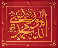
The West, in many respects, is an image-dense culture. It is interesting to see the way in which these text-dense approaches can catch us by surprise or strike us as a novelty. We seem to naturalize the image as the norm, and imagine text as the substrate of our visual lives. As these several examples show, this is hardly the actual case.
Subscribe to:
Posts (Atom)


