(cross-posted with the Iconic Books blog)
My thanks to my colleagues who made sure I saw the article in The Week from a few days ago, "How Typeface Influences the Way We Read and Think."
The insight here is a helpful one for those interested in materialist questions in the study of Scriptures: namely, that the visual presentation of the words themselves create a psychological effect in the reader, leading to increased credulity (in the case, say, of Georgia) or outright derision (as in the case of Comic Sans).
The only book on the subject of which I am aware is Graphic Design and Bible Reading: Exploratory Studies in the Typographical Representation of the Text of Scripture in Translation, by E. R. Wendland and J. P. Louw. Sadly, it looks like it has gone out of print, though I do have a copy if anyone would like to do some more exploration.
Besides that one text, I have not done much formal study of typefaces in Scripture; but I am pretty sure S. Brent Rodriguez Plate has, and I would love to hear his response to this (and other responses, as well).
Showing posts with label typefaces. Show all posts
Showing posts with label typefaces. Show all posts
Friday, June 21, 2013

Sunday, June 17, 2012
Typographic Book Covers

You can read the full text of the article here.
The tone of the article is overwhelmingly positive. While it is admitted that an unimaginative design is a detriment whether the cover is imagistic or typographic, Saller also asserts that "Even when the title lacks pizazz, typography can deliver it."
 |
| "Smoke Screen" by Maciunas |
All of this ties in to a small but sturdy volume I picked up at a used bookstore this weekend. The book is called Thinking with Type: A Critical Guide for Designers, Editors, & Students. I haven't had a chance to give it a thorough going-over yet, but looking at its index, Maciunas's name does not appear. His influence, however - through the mashed-up type style and stark use of Helvetica and other sans-serif fonts - is definitely felt.
Certainly Maciunas was not the only one to use this approach. Kurt Schwitters, Russian Constructivists, and the Bauhaus all developed versions of this type-heavy graphic style. Using words as art, with either one or no graphic elements besides, is a long-standing mode of expression.
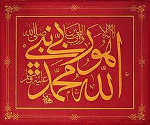
The West, in many respects, is an image-dense culture. It is interesting to see the way in which these text-dense approaches can catch us by surprise or strike us as a novelty. We seem to naturalize the image as the norm, and imagine text as the substrate of our visual lives. As these several examples show, this is hardly the actual case.
Wednesday, January 25, 2012
A short note about a typeface (Caslon, specifically)
I just received my copy of the Commonweal Associates Newsletter, an occasional publication for supporters of Commonweal magazine. In amongst the other news items was the following:
This assertion--that a "weighty" magazine demands a "weighty" typeface--is likely one we don't often think too much about. It brought to my mind a wonderful little book by E.R. Wendland and J.P. Louw, Graphic Design and Bible Reading, wherein they remind us that, "in the end, format does have meaning and people will assign a certain sense to the lay-out of a text according to how they happen to perceive it and interpret it" [37].
A typeface communicates more than just the words for which it is employed. It communicates a character, added-to those words. Erik Spiekermann, in his foundational Stop Stealing Sheep & Find Out How Type Works, makes clear that this type-character is expected to be a good match for the genre and purpose of the printed text. "Just as business people are expected to wear a suit (plus, naturally, a shirt and tie), text set for business has to look fairly serious and go about its purpose in an inconspicuous, well-organized way" [65]. Following this logic, it is only natural that "weighty" magazines are expected to sport "weighty" fonts. Serious is as serious does, after all.
Needless to say, I found it quite delightful that a magazine staff would actually come out and admit the rationale for choosing one typeface over another. While these decisions are invariably made with deliberation and care, it is not so often we get a glimpse behind the scenes into the machinations.
After redesigning the magazine in 2005, we fielded a good deal of compliments--and complaints. Reader response was mostly positive, but even fans of the revised look wondered whether the new typeface wasn't a touch too light. Well, as Jesus taught, ask and you shall receive, within at least six years. Our new new typeface, which debuted in the fall, is Caslon. It replaces the thinner-cut Goudy in headlines and body copy. You may recognize it from a little-known periodical called the New Yorker. If you haven't noticed, don't panic--the change is subtle. But important. A magazine as weighty as Commonweal ought not be printed in too light a typeface.
This assertion--that a "weighty" magazine demands a "weighty" typeface--is likely one we don't often think too much about. It brought to my mind a wonderful little book by E.R. Wendland and J.P. Louw, Graphic Design and Bible Reading,
wherein they remind us that, "in the end, format does have meaning and people will assign a certain sense to the lay-out of a text according to how they happen to perceive it and interpret it" [37].A typeface communicates more than just the words for which it is employed. It communicates a character, added-to those words. Erik Spiekermann, in his foundational Stop Stealing Sheep & Find Out How Type Works,
makes clear that this type-character is expected to be a good match for the genre and purpose of the printed text. "Just as business people are expected to wear a suit (plus, naturally, a shirt and tie), text set for business has to look fairly serious and go about its purpose in an inconspicuous, well-organized way" [65]. Following this logic, it is only natural that "weighty" magazines are expected to sport "weighty" fonts. Serious is as serious does, after all.Needless to say, I found it quite delightful that a magazine staff would actually come out and admit the rationale for choosing one typeface over another. While these decisions are invariably made with deliberation and care, it is not so often we get a glimpse behind the scenes into the machinations.
Thursday, January 19, 2012
Adventures in Letterpress, part 1
Last December I had a chance to visit briefly with Kyle Durrie, proprietrix of Portland's Power and Light Press,  who is currently on a multi-month adventure, traveling from city to city and state to state in a tricked-out delivery truck that houses two medium-weight letterpresses. Durrie was visiting Memphis, and the graphic arts professor here at CBU arranged for her to come to campus and talk and give a demonstration of the truck and the project.
The project, dubbed "Moveable Type," is the realization of a vision Durrie had while visiting her musician boyfriend on the road during a cross-country tour. "Two of my favorite things in the world are printing and road trips," Durrie says. "I wanted to figure out a way to do both things at the same time." She then set a plan in motion to get the project off the ground:
The result is a compact, functional, and very beautiful work space. The trip has consisted of Durrie pulling into towns on prearranged visits, parking her van and setting up shop. She invites people into the truck to try their hand at the press, to learn what printing is and what it feels like to make something with your worn hands and effort.
I got a chance to use th e sign press, and was amazed. Despite all my research into printing and the publishing of Bibles, I realized I had never thought much about the actual process of printing of physical pages. Just the little time I spent in the Type Truck was eye-opening. Printing has a feel, and a sound, and a smell to it that is unique. I never would have known this if it hadn't been for Durrie and her vision of bringing letterpress to the masses.
You can contribute to Kyle Durrie's continuing travels here, and you can make arrangements for her to visit your town here.
 who is currently on a multi-month adventure, traveling from city to city and state to state in a tricked-out delivery truck that houses two medium-weight letterpresses. Durrie was visiting Memphis, and the graphic arts professor here at CBU arranged for her to come to campus and talk and give a demonstration of the truck and the project.
The project, dubbed "Moveable Type," is the realization of a vision Durrie had while visiting her musician boyfriend on the road during a cross-country tour. "Two of my favorite things in the world are printing and road trips," Durrie says. "I wanted to figure out a way to do both things at the same time." She then set a plan in motion to get the project off the ground:
The plan was hatched last year while on a cross country band tour, studying maps and staring out car windows and exploring new towns. It was furthered along by listening to lots of songs about cowboys and truckers. In November 2010, I launched a fundraising campaign through Kickstarter.com, which was met with surprising and overwhelming support and success. I more than doubled my original financial goal, which turned out to be a good thing, because it turns out I had a very poor understanding of the costs involved in pulling something like this off.Durrie's success with Kickstarter allowed her to buy and retrofit a 1982 Chevy step van into a fully functional letterpress print shop. "I’ve outfitted the back of the truck with built-in cabinets and workspace, a sign press from the mid 20th century, and an 1873 Golding Official No. 3 tabletop platen press," Durrie writes on her website.
The result is a compact, functional, and very beautiful work space. The trip has consisted of Durrie pulling into towns on prearranged visits, parking her van and setting up shop. She invites people into the truck to try their hand at the press, to learn what printing is and what it feels like to make something with your worn hands and effort.
I got a chance to use th
 e sign press, and was amazed. Despite all my research into printing and the publishing of Bibles, I realized I had never thought much about the actual process of printing of physical pages. Just the little time I spent in the Type Truck was eye-opening. Printing has a feel, and a sound, and a smell to it that is unique. I never would have known this if it hadn't been for Durrie and her vision of bringing letterpress to the masses.
You can contribute to Kyle Durrie's continuing travels here, and you can make arrangements for her to visit your town here.
Monday, September 12, 2011
APHA Conference deadlines approaching
 For folks who might be interested in attending the 2011 American Printing History Association conference in San Diego this fall, the deadline for Early Bird registration is this Thursday, September 15th.
The theme this year is "Printing from the Edge":
The conference takes place October 14-15 at UC San Diego. More information can be found here at the APHA website.
What have been the transformative moments in printing history that have changed the direction of printing, typography, papermaking, bookbinding, or book design, and moved us to a new edge? What are today’s frontiers? Where is tomorrow’s edge?
Monday, February 8, 2010
"Ink & Blood: Dead Sea Scrolls to Gutenburg" coming to JPII High School in Nashville area
 John Paul II Catholic High School in Hendersonville, TN will host a traveling exhibition about incunabular (first-generation movable type) printing and ancient manuscripts this Spring.
The exhibit, entitled Ink & Blood, runs from February 15th through March 4th, 2010. The hours are somewhat erratically arranged, and you will need to purchase the $15 tickets in advance (information about both hours and tickets available here)
As the promoters of the exhibit describe:
Ink & Blood: Dead Sea Scrolls to Gutenberg is the largest collection ever assembled chronicling Western Civilization as seen through one of its most prominent and carefully preserved objets d’art—the Hebrew, Latin and English Bible.The collection includes authentic Dead Sea Scrolls, 5,000-year-old clay tablets, Hebrew Torahs, ancient Greek texts, Medieval Latin manuscripts, pages from Gutenberg’s Bible, and rare English printed Bibles.
In addition to the more than one-hundred authentic artifacts, the exhibition includes a working replica of Gutenberg’s printing press featuring live demonstrations of incunabular printing.
From the information and pictures available on the website, it looks to be a pretty interesting exhibit. I, for one, will be making the pilgrimage to Nashville to explore it. I will have a more detailed review to post then. Meanwhile, if you are in the Nashville area, I highly recommend checking it out for yourself.
Monday, December 7, 2009
Typography of the Tetragrammaton through the centuries
Kendall Soulen, at Wesley Seminary, recently sent me the following question:
I've been doing a little digging, but I haven't been able to find much information on this practice. If anyone out there reading this can point out some good resources on this question, please leave a comment below. Many thanks.
I'm working on a book on the name of the Trinity that touches on how scribes and printers have handled divine names in sacred texts. There's been a fair bit written on nomina sacra recently, but I haven't seen much on handling e.g. the Tetragram in modern european vernacular translations. Can you direct me to a source that traces the history of using capital type for LORD (HERR etc.) in recent centuries? Specifically, I'm wondering whether Luther introduced the practice, or whether it was already current before him. I would be grateful for any help.
I've been doing a little digging, but I haven't been able to find much information on this practice. If anyone out there reading this can point out some good resources on this question, please leave a comment below. Many thanks.
Subscribe to:
Posts (Atom)


